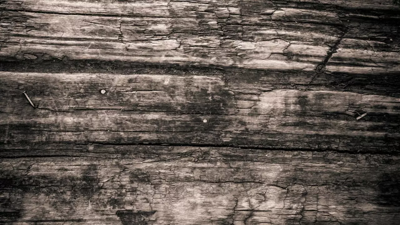
When it comes to deciding on the right color to bring out the best in your house with a dark wood trim, it can be a daunting task.
There are a variety of colors to choose from that can make your dark wood trim “pop” and create a stunning aesthetic. The key is to find the perfect balance between colors that complement the dark wood trim.
In this article, we will discuss some tips on how to use color to enhance your dark wood trim.
What Color Walls go With Dark Wood Trim
The use of different color to enhance a dark stained wood trim is a popular way to create a stylish, updated look in any home. So, what color walls go with dark wood trim?
Dark wood trim can be very dense and heavy looking, and adding color can help to bring the space into balance with lighter elements. By adding different colors around the wood trim, you can draw attention to its beauty while also reducing the heavy feel of its darkness.
Color, when used strategically, can also make a space look bigger, brighter and more open. So what’s not to like? But which color to choose… Let’s go through all the options.
Things to Consider When Choosing a Color to Complement a Dark Wood Trim
When selecting colors for dark wood trim, it’s best to stick with hues from the same family as the dark woods in order to give them a sense of harmony in the space.
Colors such as blues, greens, yellows, golds and beiges are most often used as accents for dark woods because they provide a subtle contrast without overpowering the elements.
Floors and furniture that feature these colors are great options for helping create visual interest without drawing away from the charm of dark woods.
If other shades are desired for visual contrast or adding some texture, you may choose complementary colors from across the color wheel. These can even be colors like purples and oranges, but it should be done sparingly and with attention to detail, so they don’t compete or detract from one another.
Be sure to experiment with different tones like navy blue or royal blue before making your final decision. Even darker shades within one color family can make all the difference when trying to find just the right shade for your dark trim woodwork.
Color Theory
Where to begin? The basics of color is a good place to start – so let’s learn a little about color theory first.
Color theory is an important factor to consider when choosing colors for a room. Knowing how colors interact and the impact of color combinations can be the difference between a successful design and one that is underwhelming.
In this article, we will discuss how to use color theory to make the most of dark wood trim in your home’s interior design. Better knowledge of how different colors work with one another will be of great help in deciding what color walls go with dark wood trim.
Color Wheel Basics
The color wheel is a fundamental tool for color theory and design. It depicts the relationship between colors on an invisible circle, where each hue is measured in degrees of the spectrum.
Within the 12-sectioned wheel, you will find three primary colors (red, blue and yellow), three secondary colors — created by mixing two primary colors in equal parts (green, purple and orange) — as well as six tertiary colors, resulting from combinations of primary and secondary hues.
Most designers use a 6-step or 12-step version to more accurately identify gradations of color used in their respective mediums, but not everyone is a designer.
Regardless of your level of knowledge, understanding the use of a color wheel can help guide you through your design decisions in terms of hue, saturation and value to achieve harmonious looks for your wall color.
Primary Color Wheel
In order to create a harmonious look with accurate tones that match easily, use this three-part system as your guide: red (primary), yellow (primary) and blue (primary). By blending any two together, you get an instant mix of various hues from basic tints to vibrant shades.
Secondary Color Wheel
When two or more distinct primaries are combined in any ratio with one another — for example 2 parts red to 1 part blue — secondary colors are created; such as for example, purple. A great way to understand how hues interact with one another is by playing around with saturation values. When colors vary between very bright vivid tones to duller paler blends, it helps create different moods that have visual connections within the same palettes but can show contrast too.
Tertiary Color Wheel
The tertiary palette contains both jewel-like tones – like blues/wasabi green combos or neon/earthy yellows – as well as muddy dark browns made from saturation imbalances of primaries like red/blue or yellow/green for instance.
It adds much needed shade variation that could be lost if only using a 12 arc setup on its own. This is due to the gap size differences between certain segments when compared against others which would then look disjointed when used together.
Color Schemes
Using color properly to compliment a dark wood trim can make all the difference in a room.
Color theory is all about understanding combinations of hues, tints and shades which create contrast and emphasis; that’s why picking wall paint for dark wood trim can be a challenge.
Your best option is to select one color for your walls that enhances the natural richness of your trim.
To find good options, look for subtle combinations of color that are muted and soft but still create an energetic atmosphere. Choose colors from the same color palette so they are visually similar, yet slightly different in intensity.
For example, consider pairing warm neutrals like light beiges with cool tones like greys or blues to create contrast without overpowering a room the way strong warm or cool tones could.
Another idea is to choose analogous colors on the same row on a traditional 12-dimensional color wheel. This creates harmonic flow but again doesn’t overpower a room.
Some ideal suggestions include: Off white/cream with cool green undertones, dove grey which pairs easily with medium brown woods (often used as corner trim) and pale greys/grays with taupe-purple undertones.
If you’re feeling confident and bold try an off yellow/gold or even soft lavender accent wall coupled with antique white for the remaining walls.
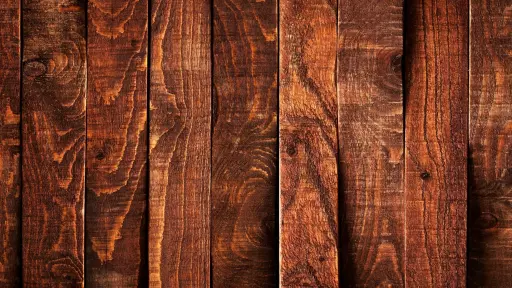
Choosing Colors for a Dark Trim
When it comes to choosing colors to enhance your dark wood trim, the options are vast. You can choose from numerous wall and window treatments, paint colors, and upholstery fabrics to create a chic and stylish look. In this article, we will delve into the various colors that work well with dark wood trim, and how to choose them to bring out the best possible look.
Contrasting Colors
Contrasting colors can be used to create balance and communicate visual hierarchy in a design. Colors affect the overall look of the design, so it is important to find the right colors that work well together.
There are several approaches to selecting effective contrasting colors, such as choosing colors from opposite sides of the color wheel or creating a look that uses analogous colors with different levels of saturation. When it comes to choosing contrasting colors for a design, being aware of color properties such as hue, value and saturation can help create desired visual effects.
Color hue describes how big an arc is on the color wheel; for example, red has a larger hue than blue since red’s path on the color wheel is wider than blue’s path. By comparing two hues of complementary colors they can create a dramatic contrast between them; this principle will make certain elements stand out more. The value of a color describes how dark or light it appears; by using two values in different locations within a design – like placing a dark blue next to a light yellow – they will contrast each other significantly and draw attention quickly.
Additionally, saturation describes how intense or dull tones appear; by combining highly saturated colors against ones with less intensity they can be used to help draw attention towards specific areas without being overwhelming or interfering with every other element in sight. By understanding each different element related to color choices – including hue, value and saturation – designers can select contrasting shades that add visual excitement while still looking balanced and harmonious together.
Complementary Colors
Complementary colors are two colors located opposite each other on a color wheel. When combined, these vibrant shades bring out the best in each other and create high contrast. The most common complementary color pairings are red-green, blue-orange, yellow-purple and black-white.
To make sure that both colors pop against one another, you should stay within the same color family; for instance, using a light orange and a dark blue will provide greater impact than using bright yellow and deep purple. When blending these color combinations in any type of design, including fashion and graphic design, it’s important to pay attention to their value — the lightness or darkness of a particular shade. For example, if choosing an orange plus dark blue pairing you would use a lighter shade for the orange so that both colors stand out against each other rather than blending into one flat tone.
Similarly, when creating outfits with complementary hues be mindful of the value so that your pieces look visually interesting rather than clashing with each other. Keep all of this in mind when deciding which color will best complement your dark wood trim.
Neutral Colors
Neutral colors are a great way to enhance the beauty of dark wood trim in your home. Light or bright whites will help bring out the grain and warmth of the wood, and create a cozy atmosphere in any room.
Other neutral color options that work well with dark wood trim include light grays, creams, light beiges, sage greens and earthy tans. These softer hues will work with any style of décor, making them an excellent choice for kitchen cabinets, wood paneling around fireplaces or any other features where you want to highlight the natural beauty of the wood.
Remember that if you use a light paint color with wood trim, you should test it out in small patches first to ensure that when your wall is completely finished that it won’t overpower the room’s design.
Color Combinations
When pairing colors with dark wood trim, it’s important to consider the room’s existing characteristics. For example, what are the wall paint colors like? Does your furniture has any dark wood accents? Do you have wood doors, or sliding glass doors? Are there warm undertones on your rugs, or is there any white paint on your artworks for example? And so on.
Color choices should be complementary to the dark wood trim and create a balanced aesthetic in the room. Whether you want a bold or muted look, you can find the perfect color combination for your walls by taking into account the various elements of the space.
Cool Colors
Cool colors are those that tend to evoke a calming and tranquil feeling. These include hues such as blue, green, and purple. Cool tones often appear in nature and are shades of pale sky blue or sage green, and they are often not a very strongly contrasting color if paired with other cool colors. When used wisely, cool colors can really give off a vibe of natural beauty.
To create a harmonious color palette, it’s best to mix two to three cool colors together with a few warm colors. Here are some common cool-toned color combinations:
Blue and Gray: Dark or light blues combine beautifully with gray for a sophisticated look that evokes intelligence and stability. These cooler tones will complement your dark wood trim elements nicely.
Purple and Green: This pairing creates an elegant scheme of jewel tones that can be used for both interior design and fashion. You can also add some orange undertones to make the scene pop.
Turquoise and White: This combination gives off a refreshing vibe reminiscent of the sea which makes great use of high contrast between the bold turquoise hue and the crispness of white.
Pink and Blue: A gentle yet eye-catching combination, pink mixed with baby blue gives off an almost whimsical look that is perfect for nurseries or sweetly themed events such as baby showers or gender reveal parties. This combination also goes well with cream walls with a lighter trim.
Warm Colors
When building a color palette, you can choose colors that create a warm feeling. Warm colors are those that evoke the feeling of heat or fire such as red, orange, and yellow.
When combined, these colors can create a cozy feel in any space, and work perfectly with dark woodwork. Combinations of two to three warm shades provide more visual interest than one solid hue. It is important however to adjust the intensity of each hue so as not to overwhelm the end result.
By choosing one dominant hue and two supporting hues that 1) share a common undertone and 2) contrast in value (lightness or darkness), you can create an eye-catching combination that reflects the intended warmth throughout your space.
Here are some ideas for color combinations with warm colors:
Red and Yellow: This combination is classic and has been used hundreds of times throughout history. By adding both colors together it also creates an element of vibrancy that pairs well in both contemporary homes or rustic homes alike.
Orange and Brown: Whether pairing burnt orange with deep brown, or pale peach with beige – this duo creates an earthy feel while still maintaining a hint of warmth through the orange tones. If you happen to have white walls, this combination can also make for a royal feel.
Red, Yellow, and Orange: A great starting point when wanting to pull off a warm color palette without going overboard on any single hue, this trifecta adds texture and interest without being overly bright or loud. These colors can work well in country chic homes or even more modern living spaces as well. For a really “natural beauty” look, combine the with a green wall, and bask in the result.
Monochromatic Colors
Monochromatic colors are shades of one hue that vary in intensity and tint. This means that you’re going for different gradations of a single color family. For example, if you have a dark wood trim and you want to use monochromatic colors, consider shades from the same color family like burgundy or navy blue. While they may look different when on the wall, they will still coordinate nicely with each other and with the dark wood trim.
Another great way to complement your dark wood trim is to play up contrasting tones such as black and white or other high contrast colors such as yellow and blue. To keep the look balanced, choose accents in similar tones such as light blues to match navy walls or earthy greens when using hunter green walls. If you want to get daring, you can go with jewel tones like ruby or emerald green paired with dark brown or black accents for a really bold statement. If your walls are neutral, a good rule of thumb is to add some bold punches of color; likewise, with intense hues, use more muted accents around it for balance.
Tips and Tricks for Using Color With Dark Wood Trims
Dark wood trims can often provide an elegant and luxurious feel to a room. But when decorating with dark wood trim, it can be tricky to know what color walls to pair it with. Fortunately, there are a few tips and tricks to help you work with color to successfully enhance your dark wood trim. Let’s explore some of these ideas.
Test out Different Colors Before Committing to One
When you’re looking to make a lasting décor statement, it’s essential to think ahead and invest in quality décor items.
However, it’s not always easy to find the perfect combination of colors and textures straight away. That’s why testing out different colors before committing to one color can be a great idea. Since many smaller items can be easily moved, you can try out different color combinations throughout your living space before deciding on what suits your needs the best. Start with larger focal points like furniture and then move down to smaller accessories like cushions, rugs and artwork. Take time to experiment until you get the balance right. Be aware of the impact of light sources on colors as some may look differently in different parts of a room or at different times of day.
The idea is to layer texture and color until you achieve a harmonious look that is comfortable for everyday living as well as for guests. Showcase key pieces on shelves or against wall surfaces in order to draw attention to them – after all; it’s all about creating an environment that makes you feel at home!
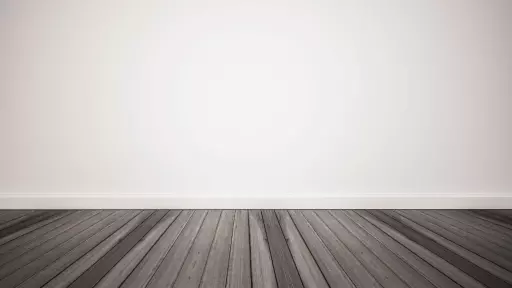
Consider The Natural Light in The Room
The natural light in a room can have a huge impact on the overall look and feel of a space, and this is especially true when you’re considering what color walls to pair with dark wood trim.
You should always consider if you will have access to natural or artificial light in the room as this can help determine the amount of brightness for the walls.
If you’ve got plenty of natural light, such as an office with large windows or an outdoor porch with gorgeous natural lighting coming from outside, then you can be more liberal with wall colors.
Rich jewel tones like deep teal and navy blue pair particularly well with dark wood trim, but even more vibrant shades like green apple or coral could also create a striking contrast when paired.
However, if your room has limited natural lighting due to heavy furnishings or dim window coverings, be cautious when choosing wall colors. Bright colors may simply become too overwhelming and make your room appear busy or cramped. Light tan colors will still contrast nicely without appearing too bold, and subtle neutrals like white and light gray will provide just enough contrast while still creating a calm atmosphere.
Ultimately, it’s best to use paint samples on part of your wall before committing to use them throughout the entire space. This way you will know exactly what color works for your aesthetic goals, and which don’t.